Product Details Page Redesign
Humanizing, modernizing, and differentiating our product details page.
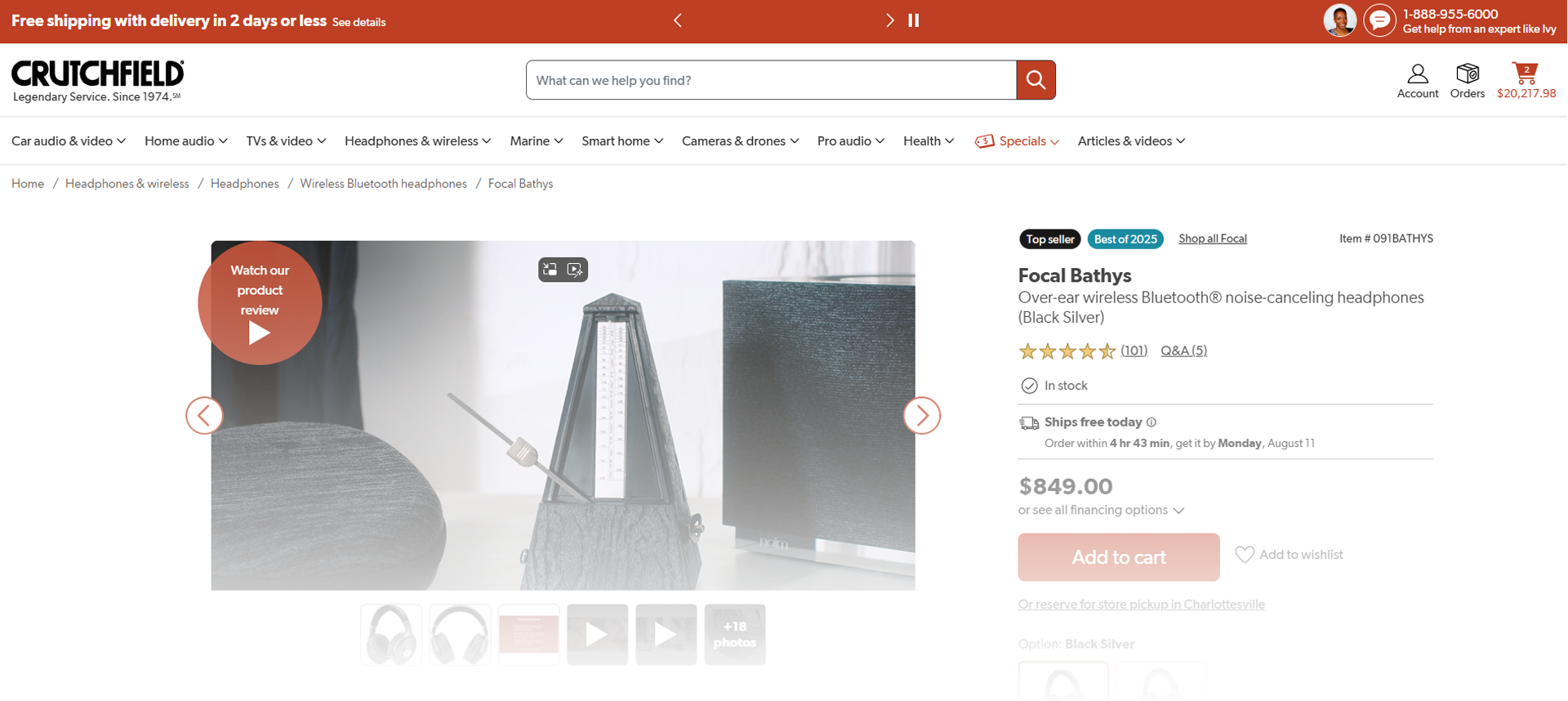
Background
Problem: The Product Details Page (PDP) on Crutchfield.com is the core decision-making hub for customers shopping for complex electronics. While it offered rich product information, its outdated structure and inconsistent presentation made it difficult for users to find key details, understand advanced features, and confidently compare products. This friction negatively impacted conversion rates and increased the burden on customer service advisors handling pre-purchase questions.
Goals: To address these issues, we led a comprehensive redesign of the PDP focused on modernization, humanization, and differentiation. Our goal was to reorganize content to better match customer mental models, reflect the strength of our product research, and accommodate new content types that didn’t fit the existing page layout. The initiative aimed to elevate the shopping experience by making product discovery easier and Crutchfield’s expertise more accessible — ultimately strengthening the page’s ability to convert and inform.
My role: As the UX Designer Team Lead, I supported the agile team throughout the entire redesign lifecycle. My involvement was especially critical during the prototyping and user testing phases, where I led design iterations in Figma informed by user insights and stakeholder feedback. I collaborated closely with developers during handoff to preserve design integrity and ensure all variations were fully accounted for. In parallel, I worked with content strategists and the creative team to plan and structure new content ahead of development — laying the foundation for what would become a future MVP.
Research
It had been almost a decade since the PDP had last seen a refresh. Multiple user tests, Baymard audits, and internal department needs and desires were hinting it was time for a change, and they became the starting point for research.
Where is the UI not meeting customers’ expectations?
Where has our UI gotten old and not keeping up with benchmark guidelines?
What kinds of UI are our product specialists, writers, photographers, and higher-ups seeing elsewhere, that we could be inspired by and make our own?
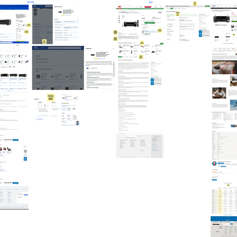
Competitive analysis
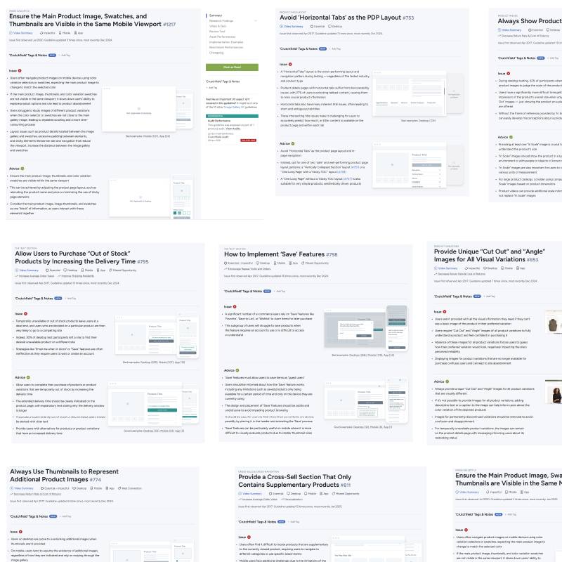
Flagged issues from Baymard Audit
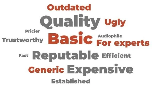
Word cloud based on 3 rounds of user testing on PDP
Iteration & User Testing
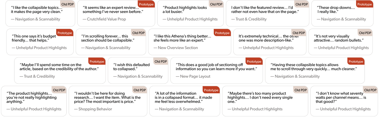
7 rounds of testing, 62 participants total, followed by 3 primary A/B tests
The redesign set out to address the biggest pain points of the old PDP:
Too much text → now condensed and layered
Confusing layout → now structured and collapsible
Distracting or gimmicky elements → now more credible and expert‑driven
Hard‑to‑find reviews → now surfaced and easier to scan
Overwhelming information → now organized and user‑controlled
Final Design
A/B Test #1: Top of the page on Home products
Resulted in +3.9% user conversion
Our main priority was redesigning the buy box, where customers find the most important product information. Based on user testing and benchmark data, we focused on the following improvements:
Making the product image larger on desktop
Adding product image thumbnails on mobile
Adding a short product description higher up on the page
Cleaning up the user interface to make the page more scannable
Rewriting all modules in Vue making the page load faster
Old design
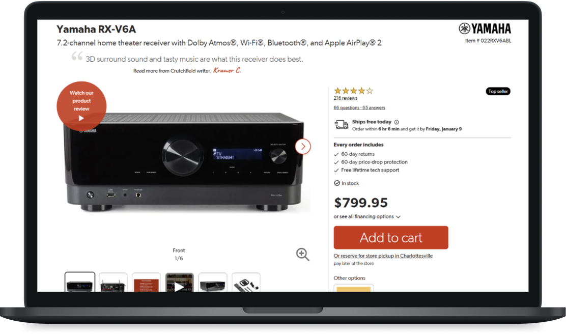
New design
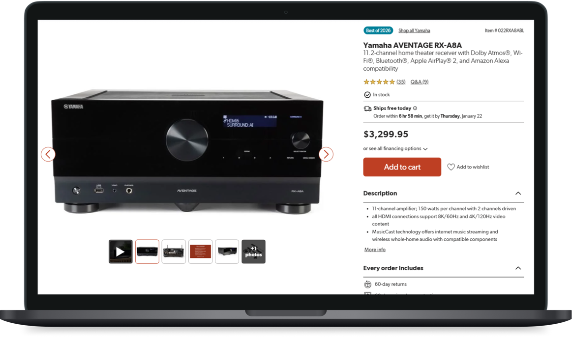
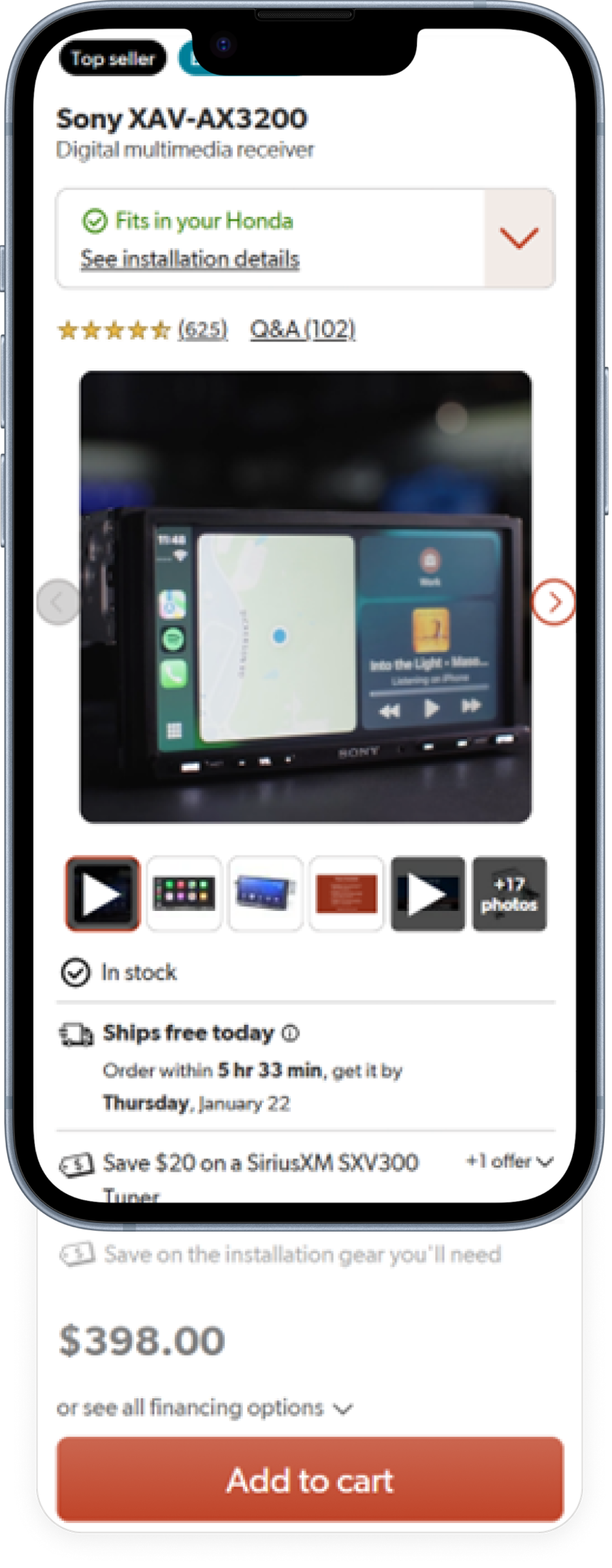
A/B Test #1 (mobile): Condensing mobile
Resulted in +9.8% in conversion on mobile
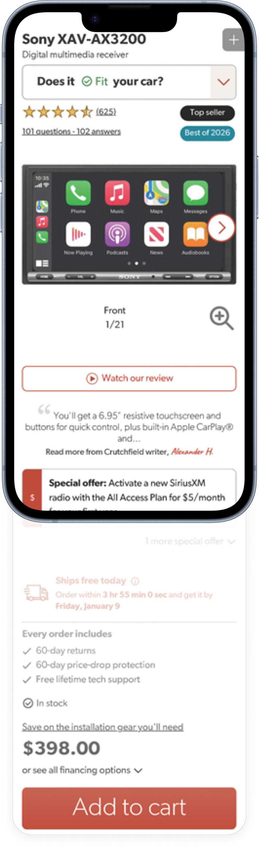
On mobile, the buy box pushed key product information too far down the page. Analytics showed that many users were leaving before they even reached the Add to Cart button. To address this, we made the following changes:
Added smaller thumbnails below the main product image to encourage engagement, resulting in a 55% increase in image engagement.
Repositioned the navigation arrow so it no longer obscured the product image.
Made the page easier to scan so users could find key information at a glance.
Brought product information higher up the page to help users access it more quickly.
New design
Old design
A/B Test #2: Bottom of the page on Home products
Resulted in +4% user conversion
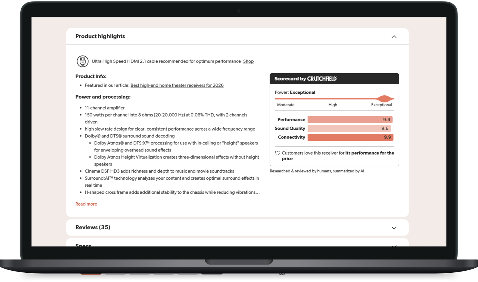
In our second A/B test, we redesigned the bottom of the product page for home products. We focused on improving content structure, simplifying navigation, and introducing new ways to explore and compare products. The most impactful changes included:
Changed product info tabs to collapsible sections (+46% interaction)
Truncated product highlights
Moved ‘What’s in the box’ to its own collapsible section.
Changed the title of the Details tab to “Specs”
Added a new section for product videos
Redesigned the product compare chart
Created a new presentation for items within a series
Rewrote all modules in Vue
Old design
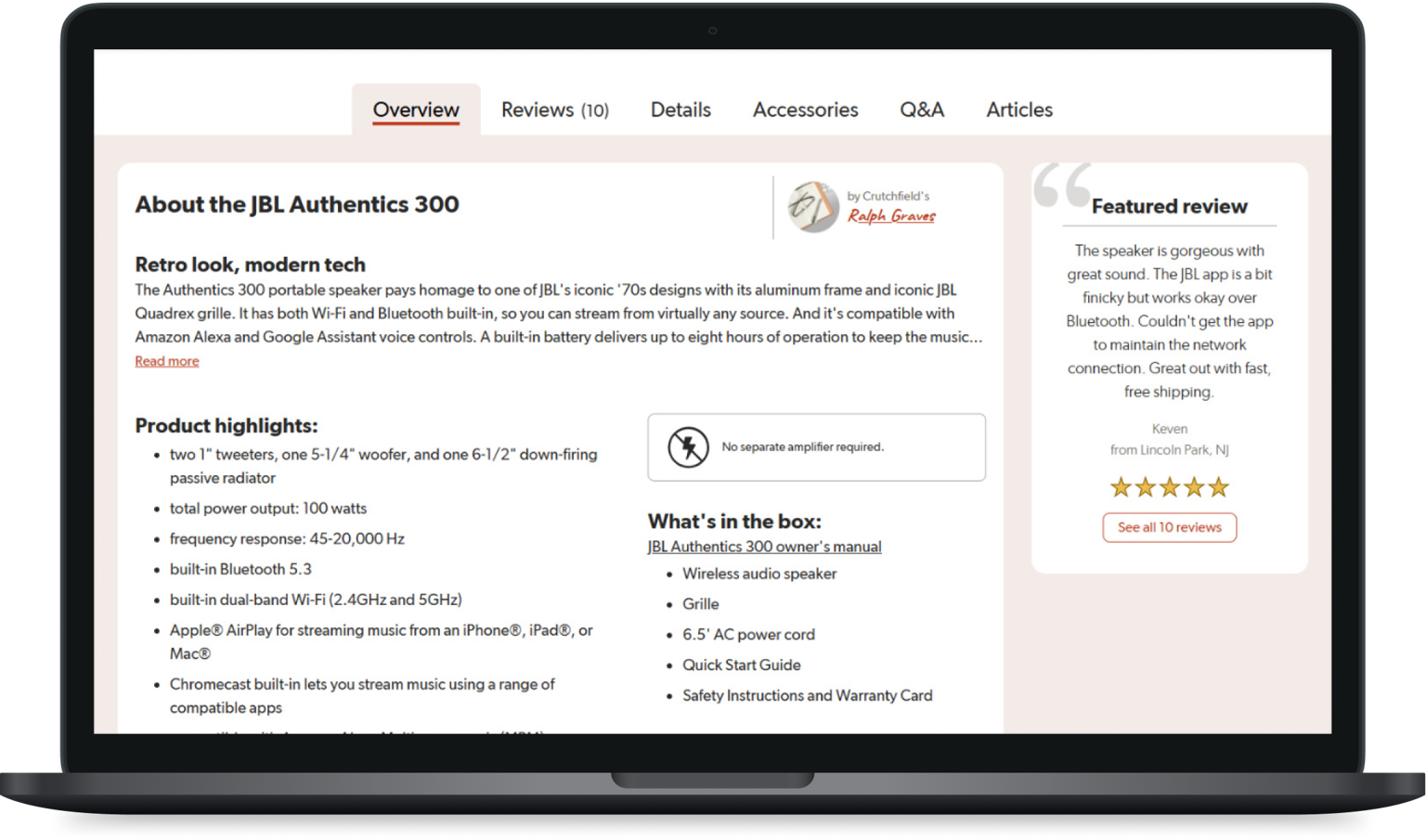
New design
A/B Test #3: All car product pages
Resulted in +3% user conversion
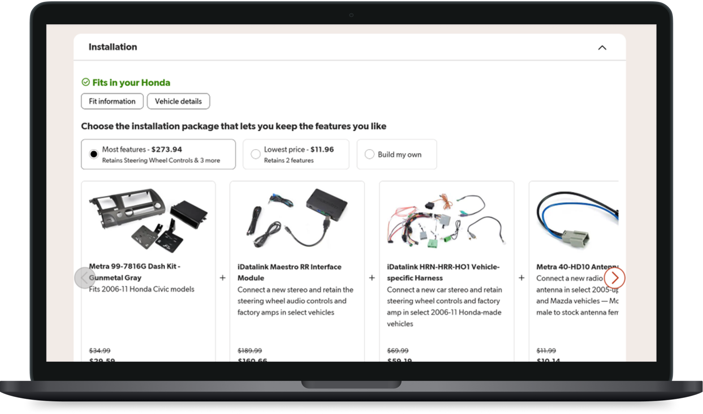
Car shoppers have different needs than home customers, and the page includes additional modules to support the vehicle shopping experience. For this reason, we ran a separate A/B test to evaluate the impact of our design changes. Key changes included:
Rebuilt the vehicle selector in Vue
Cleaned up and rebuilt the fit strip and other car-specific UI in Vue
Moved the Installation tab into a collapsible section, increasing click-through by 60% on desktop and 79% on mobile

Old design
New design
Results
A/B Test Results
The redesign resulted in a 4% increase in conversion on mobile devices. Desktop conversion remained flat for MVP-1.
User Tester
“[The product details page] is easier to digest as far as the eye. I don't feel like I'm overwhelmed by information.”
A/B Test Results
Estimated annual impact = additional $2.6 million in sales
What’s next?
We’re continuing to improve the product page experience by making comparisons clearer, refining the vehicle shopping journey, and updating key content modules. We’re also exploring ways to make pages more dynamic and help customers discover relevant products.
Key areas of focus include:
Improving product comparison charts
Enhancing the vehicle shopping experience
Updating the recently viewed products module
Exploring more dynamic page layouts
Testing new content modules to improve product discovery